Canada 150 Logos
The Canadian graphic arts community has been discussing design ideas for Canada’s upcoming 150th Anniversary.
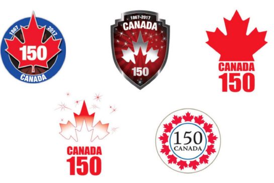
Some designers are dissatisfied with the original prototype designs and have created what they consider to be better versions. Here are the original five.
This discussion has provided media teachers of ALL grades with great opportunities for discussions, both of representation and of codes and conventions.
The discussion is explained here, the original designs here.
Discussions can range from the codes and conventions of logo design (colour, line, maple leaf, beaver, etc.) to the qualities of the representations (Which designs best represent 21st century Canada?).
Perhaps one of the most intriguing designs is this one.
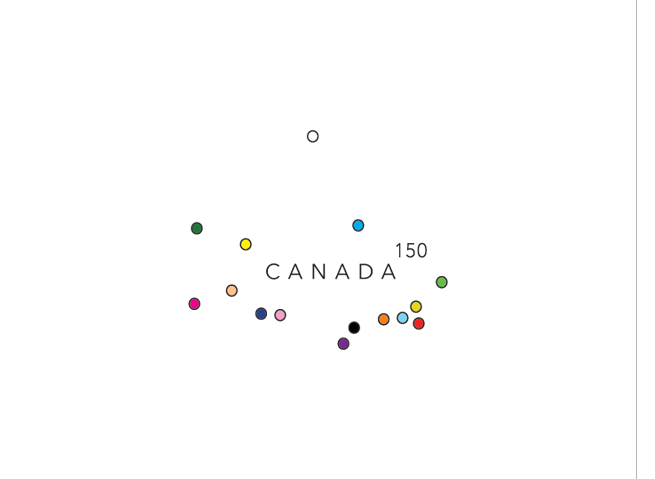
No beaver, no maple leaf, no tree, no mountains, no aurora. What could the symbolism be? Here is a hint.
Look at the dots.
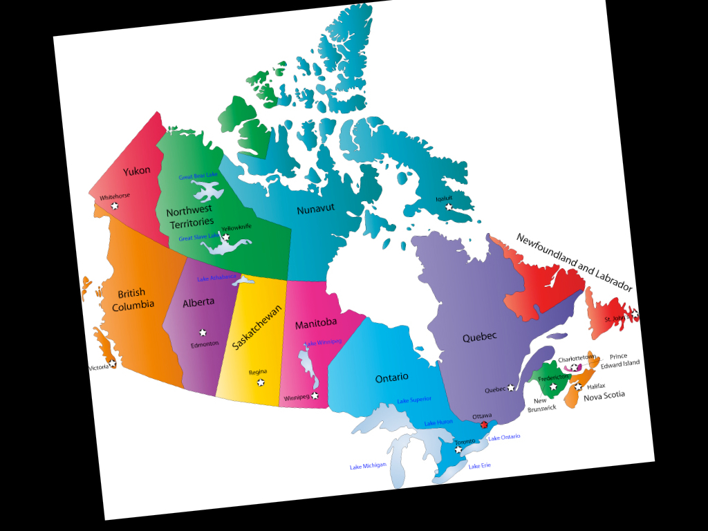
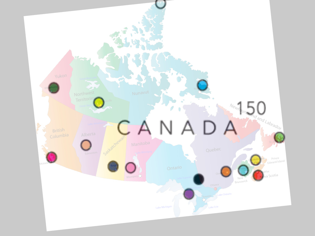
Look at the map.
Look at the dots.
Look at the map.
Make connections.
Infer.
The dots are representations of Canada’s capitol cities plus one for its northern-most inhabited location.
Why are they coloured? Might it be a representation of Canada’s multicultural and/or gay communities?
Too abstract? You decide.
Ultimately, students can be invited to select and defend their choices for best and/or worst designs and/or create their own.